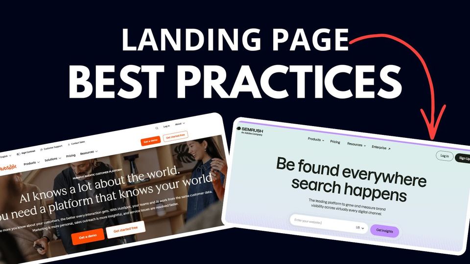
10 Best Landing Page Practices With Examples
Most landing pages don't convert because of these 3 things:
- Bad visual design
- Boring content
- Don't understand the consumer's buying psychology.
The practices I shared with you won't go away; they've proven themselves since I started learning marketing back in 2015.
Let's get started.
1. Start with a "Benefit or Problem Driven" headline

Focus on the benefits, features, and goals.
You should only use one sentence, targeting one audience group with one outcome.
A few more examples for you:
- How to achieve X using Y
- Reduce X even if you're at the stage of Y
- Scale your X, with the latest Y, using only Z
2. Add a Supporting Headline

Supporting headlines reinforce the message that follows the main headline.
The font size should be smaller than the main headline.
Use a different colour, with smaller font size to visually showcase the differences from the headline.
3. Use "Top Announcement Bar"

This top bar is designed to quickly grab attention right from the start.
It should be short, with a direct message about what offer or promo is available to the visitors.
This type of bar is powerful because it is designed to be noticeable without being intrusive, making it effective for conveying important messages or offers.
4. Include Real-Time Social Proof

You may have seen these when checking out hotel deals on travel sites.
Is the data real?
"Yes" and "No.
Yes, if the social proof data was tracked and previous user interaction was recorded and showcased on your.
No, if you don't have any data collected yet, people sometimes use dummy data and replace it with real data once there's enough.
5. Point Forms to Summarise Your Offer

Users want to know what this offer is about as quickly as possible.
Therefore, bullet points or numbered point forms can structure and organize the information on the landing page clearly.
6. Add Countdown Timer

A countdown timer creates a sense of urgency and scarcity around your offer, prompting people to take action quickly.
- I recommend including it at the top of the landing page hero section.
- Set the timer from 10 minutes to 72 hours, depending on the campaign duration.
- Then decide what happens after the countdown ends.
Do you want to hide the timer, redirect to another page, or do nothing when it is 0 seconds?
7. Include a Frequently Asked Questions (FAQ) section

You should only include FAQ with the most pressing questions under the section.
For example, our company use it as an "objection handler" and "what to expect" section, questions like:
- What to expect after payment.
- Who is this offer for?
- Why is it expensive? Or why is it Free?
- Is there a catch?
- How does the refund work?
- What if I'm not satisfied with the proposal?
- Can you guarantee results?
8. Add Your Guarantees

Use guarantees to instil confidence and security before they make a payment.
Need some idea? Here are some examples of guarantees:
- Money back guaranteed
- Results guaranteed
- Lowest price guaranteed
- Performance guaranteed
- Lifetime guaranteed
9. Add "What to Expect" Section

Inform in advance "what to expect" after they've signed up.
This section increases transparency by providing clarity for customers.
Help your users understand and make it straightforward so they can make faster decisions, leading to higher conversion rates.
The "What to Expect" section should be in point form, with icons and the steps involved; remember to simplify the steps!
10. Screenshots As Proof of Results

The result always speaks louder than words, as simple as that.
It showcases your expertise and establishes your authority.
Your Turn
Hope this is helpful for you!
Do you have any questions about these practices? Or perhaps you have some cool tips that I didn't include here.
What other best practices do you think should be added here?
Let me know your thoughts!
Member discussion